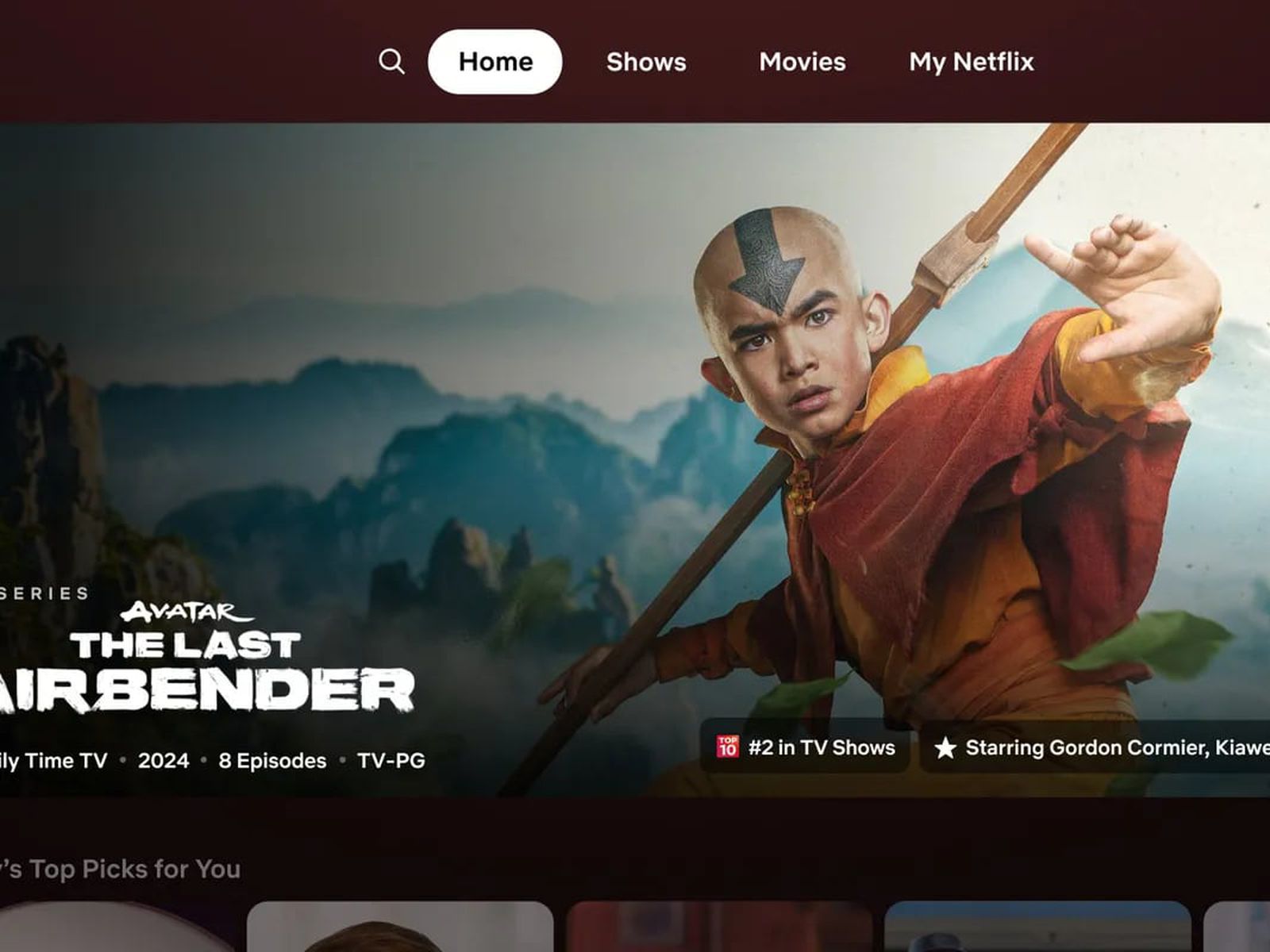
Netflix is testing a major redesign for its TV app homepage. This news has excited many users. The new design aims to improve user experience and make navigation easier.
New Features and Changes
The redesigned homepage comes with several new features. These changes focus on enhancing user interaction. Here are some of the key updates.
1. Simplified Navigation
Netflix has simplified the navigation menu. The new menu is more intuitive.
- The top navigation bar now has fewer options.
- Main categories like “Home,” “Search,” and “My List” are easy to access.
- Subcategories are organized under these main tabs.
2. Personalized Recommendations
The new design offers better personalized recommendations.
- The homepage shows personalized rows based on viewing history.
- New algorithms improve the accuracy of recommendations.
- Users will see more relevant content at the top of the homepage.
3. Improved Search Function
The search function has been upgraded. It is now faster and more accurate.
- Search results appear as you type.
- Suggestions are more relevant.
- Users can search by genre, actor, director, and more.
4. Enhanced Visuals
The visual layout of the homepage has been improved.
- Larger thumbnails for shows and movies.
- High-resolution images make browsing more enjoyable.
- Improved layout for better readability.
5. New Categories and Rows
Netflix has introduced new categories and rows.
- Categories like “Trending Now,” “Top Picks,” and “New Releases” are prominently displayed.
- Personalized rows like “Because You Watched” offer tailored suggestions.
- New rows for different genres and moods.
6. User Profiles
User profiles have been given a fresh look.
- Profiles now have a more personalized appearance.
- Each profile shows recently watched and recommended content.
- Users can easily switch between profiles.
User Reactions
The new design is currently in the testing phase. Netflix is gathering feedback from a select group of users. The reactions so far have been positive.
Positive Feedback:
- Users find the new design more user-friendly.
- The simplified navigation makes it easier to find content.
- Personalized recommendations are more accurate.
Areas for Improvement:
- Some users suggest further tweaks to the search function.
- A few users prefer the old layout for its simplicity.
- Feedback is being used to make final adjustments.
Why the Redesign?
Netflix aims to enhance user experience with this redesign. The streaming giant is constantly evolving. The new design reflects the latest trends in user interface design.
- The goal is to keep users engaged.
- Improved navigation and recommendations can lead to more viewing time.
- Netflix wants to stay ahead of competitors like Disney+ and Amazon Prime.
Future Plans
Netflix plans to roll out the new design globally. The current testing phase will help iron out any issues.
- The global rollout is expected later this year.
- Continuous updates will be made based on user feedback.
- Netflix aims to create a seamless and enjoyable viewing experience.
Conclusion
Netflix’s major redesign for its TV app homepage is a significant update. The new design focuses on simplified navigation, personalized recommendations, and improved visuals. Early feedback is positive, and Netflix is using this feedback to make final adjustments. The redesign aims to enhance user experience and keep Netflix ahead of its competitors. Keep an eye out for the global rollout later this year and enjoy a better Netflix experience.

